The Overview dashboard provides real-time analytics on how your SaaS product is being used through AI platforms and agents. It aggregates data across all tenants and tools, giving you a single view of AI adoption, user activity, policy enforcement, and tool usage.
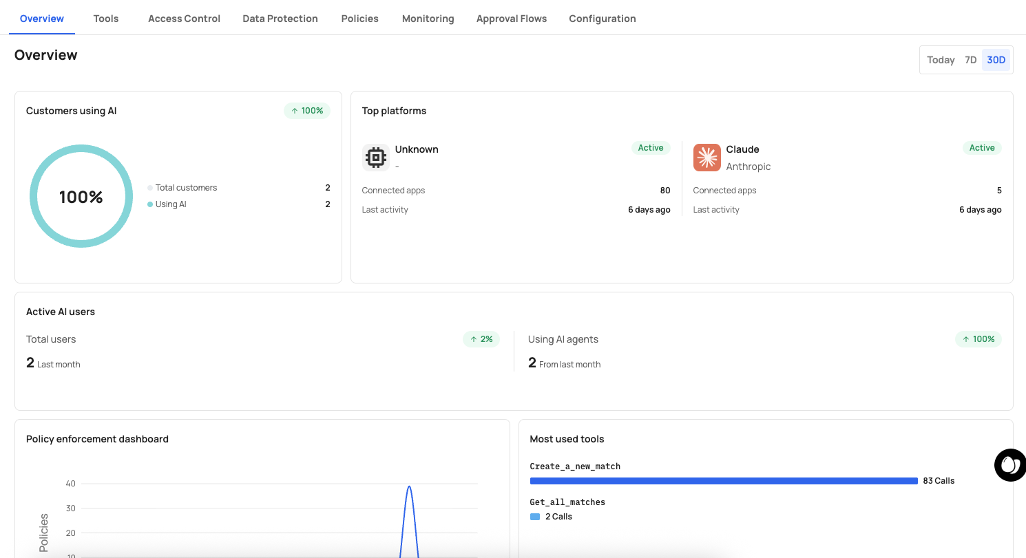
A time range selector in the top-right corner lets you filter all dashboard data by Today, 7D (7 days), or 30D (30 days).
This card shows the percentage and count of customers actively using AI to interact with your product.
| Metric | Description |
|---|---|
| Total customers | The total number of customers (tenants) in your environment. |
| Using AI | The number of customers that have connected at least one AI platform and made tool calls. |
A donut chart visualizes the ratio, making it easy to track AI adoption across your customer base.
This card shows which AI platforms your customers are connecting through, along with their status and activity.
| Field | Description |
|---|---|
| Platform name and provider | The AI platform (e.g., "Claude" by "Anthropic") with its logo. |
| Status | Whether the platform connection is Active or inactive. |
| Connected apps | The number of applications connected through this platform. |
| Last activity | How recently the platform was used (e.g., "10 days ago"). |
Use this data to understand which AI platforms drive the most engagement and where to focus integration efforts.
This section tracks user-level AI activity over time.
| Metric | Description |
|---|---|
| Total users | The total number of users in your environment, with a trend indicator showing change from the previous period (e.g., "-1%" in red). |
| Last month | The user count from the previous month for comparison. |
| Using AI agents | The number of users actively making tool calls through AI agents. |
| From last month | The AI agent user count from the previous month. |
Use this to measure AI adoption growth at the user level and identify trends.
A time-series chart that visualizes how your security policies are performing over the selected time range. The chart plots policy evaluations over time, showing:
- The number of policy triggers per time interval.
- Trends in policy enforcement activity (spikes may indicate unusual behavior or new policy deployments).
Use this to verify that your policies are active and to detect anomalies such as sudden increases in denials or approval requests.
A horizontal bar chart ranking the most frequently called tools by number of invocations.
Each entry shows:
- Tool name (e.g.,
Create_a_new_expense,List_all_expenses). - Call count — The total number of times the tool was called in the selected time range (e.g., "6 Calls", "4 Calls").
Use this to identify which API capabilities are most valuable for AI automation, surface underused tools that may need better descriptions, and understand which tools may need stricter governance.
The left sidebar provides quick access to the main sections:
| Icon | Section |
|---|---|
| Home | Overview dashboard |
| Grid (Apps) | Application management and control plane |
| Chart (Analytics) | Monitoring and analytics |
The top navigation bar shows:
- Your account name (e.g., "Agents Demo") with an account switcher.
- The current application name (e.g., "Expense Management App").
- A grid menu for additional options.
- Your user profile avatar.