You can fully customize the appearance and layout of your login box directly from the Frontegg Portal using the visual configuration panel. To access these options:
- Navigate to the Frontegg Portal.
- Go to the Login Box section.
- Use the Styles Panel on the right-hand side to adjust design settings.
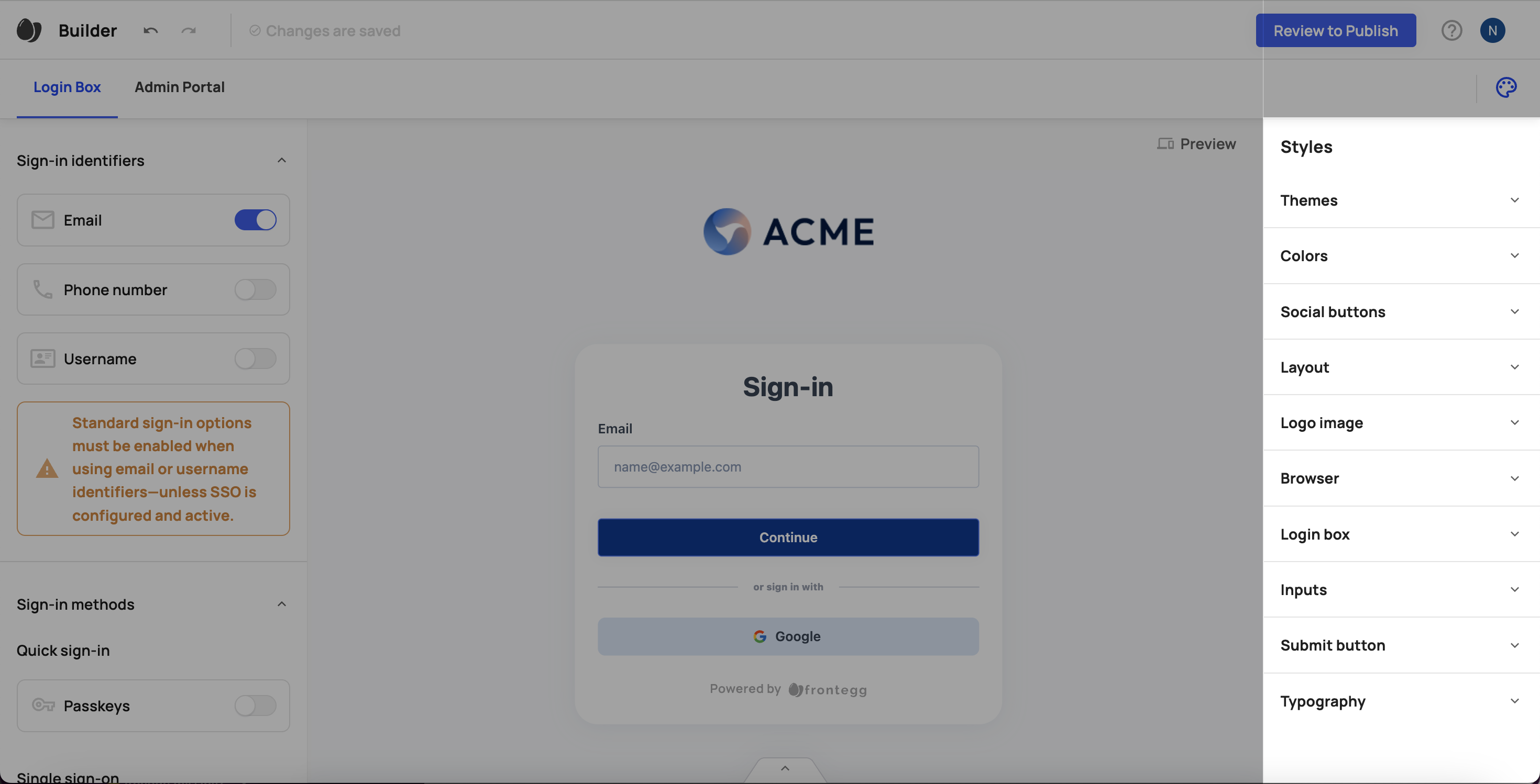
- Choose from pre-set themes:
modernclassicvividdark
- Adjust the following color types:
- Primary
- Secondary
- Error
- Position: Define the location of the social login buttons.
- Style States: Customize for different UI states:
base,hover,focus,active,disabled
- Style Attributes per State:
- Font size
- Font weight
- Font color
- Background color
- Border color
- Border radius
- Border width
- Format: Choose a split layout that separates sign-in elements from additional content.
- Content Box:
- Set the position and width
- Define the content type (e.g., image, text, video)
- Background:
- Set a background image or background color
- Add an optional background link
- Upload and select a custom logo
- Define placement and alignment
- Set the favicon
- Customize the URL
- Set the browser title
- Customize the main container:
- Background color
- Border radius
- Shadow
- Define visual properties for input fields in all UI states:
default,hover,focus,active,disabled
- Customizable attributes include:
- Fill color
- Text color
- Placeholder text color
- Text size and width
- Border color, radius, and width
- Label color, size, and width
- Define styles per state:
default,hover,focus,active,disabled
- Customize:
- Font size and weight
- Font color
- Background color
- Border color, radius, and width
- Select the global font family to match your brand guidelines
Depending on whether you are using the hosted or the embedded method, if you wish to use styles or localizations that are not part of the Frontegg Builder, you will need to serve the themeOptions and localizations objects from your application's code or a CDN as described in the advanced setup.